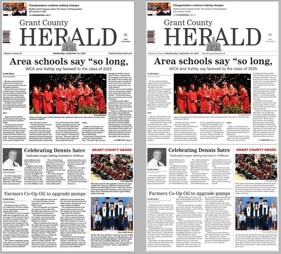
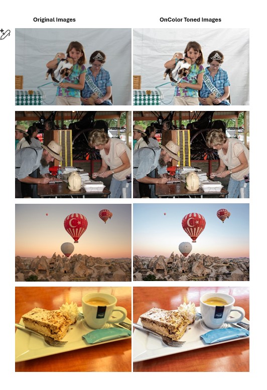
Many newspapers face these same design dilemmas
Kevin Slimp
Dec 1, 2022
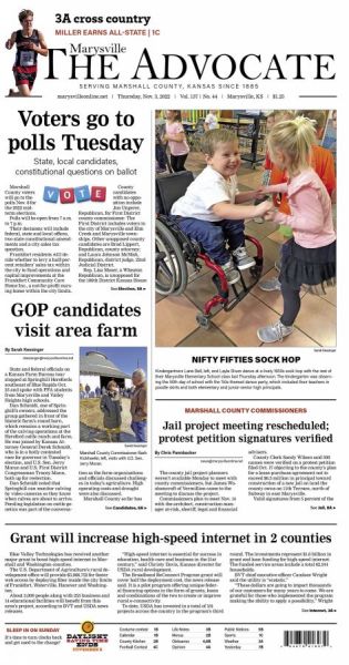

As I write this, I’ve just returned from a trip to Marysville, Kansas, where I worked with the staff of The Marysville Advocate on their new design, which went to the press today. Over the past few months, I’ve worked on redesigns with several newspapers all over the U.S., and I’ve noticed that the technical and design issues faced by these newspapers were often quite similar. I thought it might be helpful to share my suggestions for a few problems that seem to crop up in many newspapers.
Clean is in: I hear it all the time after redesigns, “Wow, our pages look so clean!” People often don’t notice how cluttered their pages look until they compare them to other newspapers or redesign their pages. The paper in Kansas wasn’t as “cluttered” as many, but with a few tweaks, the pages looked even cleaner.
Text alignment: By setting the body type to “align to grid” in InDesign, lines of body text align throughout every page. By aligning text to the grid, columns always line up evenly at the top and bottom. It’s important to set only the body text to align to grids. Aligning anything else causes confusion. I was proud when I saw the pages of The Marysville Advocate this morning, and all body text aligned evenly across the pages.
Thin lines are in: I remember when most newspapers set borders around photos at 1 point or higher. With the advent of computer design, most moved their border size between .5 and 1-point. With better methods for making plates and printing, it’s possible to have even thinner lines around pictures. I’ve been using .4-point borders on most pages I’ve designed lately. Thin lines fit with the “Clean is in” philosophy.
Use clipping paths (cutouts) sparingly: It’s easy to get excited about clipping paths and other techniques available in Photoshop and InDesign. Just because it’s “fun” or “cute” doesn’t mean the reader wants to see these special effects throughout your pages. A clipping path can be very effective now and then — perhaps on a cover page. But when overused, they get in the way of good design.
The fewer typefaces, the better: I only used two font families when designing the Marysville newspaper. Headlines and body text were all in the same serif typeface. Subheads, cutlines, and other text elements were variations of the same sans-serif typeface. When a skilled designer mentioned how many fonts were available in Adobe Creative Cloud, I reminded her that every high school student has access to the same fonts. We want to be sure our pages don’t look like high school newsletters.
Ragged right is in: I know. You’ve used justified text since the 1850s. Remember that readers prefer ragged-right text. I won’t be there when you’re designing your paper, and I probably won’t be reading it, so it doesn’t matter to me how you align your text. It does, however, matter to your readers. A publisher in New York wrote to me about ragged-right text today: “Thanks for helping us stay abreast of design trends.”
Always use the shoulder rule: Crop those photos to the shoulders. All that space to the left, right and above the image is wasted space. There are times we break this rule, but they should be rare. By cropping photos correctly, space is saved for more text — or to fill the photo frame, making the picture appear even more prominent.
Replace older fonts: Use Acumin instead of Helvetica, Nimrod in place of Times or Schoolbook. Resist the urge to use a typeface you were using 15 years ago.
“Good design never changes.” That’s what my design mentor, Ed Henninger, told me many times.
Sure, the tools we use to design pages change. The fonts, styles and elements change with the times. But the basics of good design never change.
When I’m tempted to try something flashy or “out of the box” on a page, I always ask myself, “Is that good design?” Otherwise, I might look at the page a few years from now and ask myself, “What was I thinking?”
Kevin Slimp is former director of The University of Tennessee Newspaper Institute and founder of NewspaperAcademy.com. Contact Kevin at: kevin@kevinslimp.com.
