How to design eye-catching and memorable digital ads
Katelyn Mary Skaggs
Jun 1, 2023


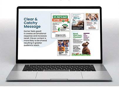
My main recommendation for digital ad design is simple — less is more.
When it comes to digital ads, generally due to size, you must have less. A half–page ad and an ad built to be viewed on a cellphone cannot possibly have the same number of details and information.
The digital world moves fast, and people scroll at light speed, so the goal is to create ads that make people stop mid-scroll and click.
I have four major recommendations for the design of digital ads.
First, have a strong and simple message that will make people stop mid-scroll.
Generally, it takes five times of seeing or just scrolling past the same digital ad before someone actually stops and reads it. The goal is to make them stop on the first view.
The internet moves fast, and so do people’s thumbs, so make sure you have a scroll–stopping design.
While a print ad can be seen by a large demographic of people, most digital ads can be targeted to a specific demographic, so ads should be created with this in mind. Make sure your ads have a tailored message for the demographic you are trying to reach. A digital ad will probably never be geared toward moms in their 30s and men in their 50s at the same time. Ad content and message should be crafted to address a specific audience.
Second, design with the idea to create engagement.
On digital ads, the basic form of engagement is a click, which will boost the CTR (click through rate) on digital campaigns. Better CTRs mean better results, which mean clients are more likely to keep running the ads. You want people to click on the ad to follow the link where they can buy a product or learn more about a company.
A call to action on an ad is an easy way to create engagement. Phrases like watch video, buy now, subscribe for newsletter, and learn more are simple calls to actions. I would recommend placing the phases in a button on the ad so people recognize they can click to complete the action.
Engagement also means people start thinking about the ad after seeing it, maybe look up a company’s social media pages later, look up the website or even visit a brick-and-mortar store.
Third is to make sure you have a bold design. People see a lot while they scroll and search online, so digital ads should be created to make them stop and really see the ad.
Digital ads should be built with all the sound design principles that print ads have always have, including a focus point, powerful color and strong fonts. Black–and–white ads are a thing of the past in the digital world, so make sure colors are picked to make someone stop mid scroll.
On fonts, make sure to use one font or no more than three. Make sure to avoid script fonts and small sized fonts; remember, most ads are viewed on a small phone screen.
White space is always an idea to make sure your ad stands out.
Fourth, cut the details. Due to the smaller sizes of digital ads, you have far less space to list normal details like phone numbers, addresses, websites and more.
This has come as a great shock to many of our clients when I tell them that I will not be including something like a phone number for a digital ad.
Once I walk them through why it's a waste of space on a digital ad, they agree with me. In a world where people don’t memorize numbers anymore, it makes no sense for a phone number on a digital ad. If people can’t click and automatically call, they would have to remember the number and type it into their phone keypad. Many people, especially younger, would rather do anything else than place a phone call.
You have the link attached to the ad to have all those details typically in a print ad.
For print ads, people can see the ad for a long time due to reading the story on the page or even laying open to a specific page.
Digital ads are sometimes only seen for a second, so you want to make the main point eye-catching and memorable.
Katelyn Mary Skaggs is the digital marketing manager for Leader Publications, a group of four papers in Festus, Missouri. Skaggs, a Southeast Missouri State University graduate, joined their ranks in January 2019 as a reporter. Email katelynmaryskaggs@leaderpublications.biz


